
Formular: Bootstrap
Last updated 05 August 2017 formular v0.2The Bootstrap builder can render horizontal forms, inline forms, and vertical forms, which is the default. Currently, the API to render elements is identical for BS3 and BS4.
Where’s the EXAMPLE CODE?
Vertical Forms
To display form elements from to top to bottom use the vertical form builder.
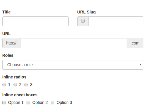
= form(model.contract, url, builder: :bootstrap3) do |f|
  = f.row
    = f.input :title, label: "Title", inline_col_class: ['col-md-6']
    = f.input_group :title, label: "URL Slug", inline_col_class: ['col-md-6'] do |input|
      = input.group_addon('<input type="checkbox" value="1"/>')
      = input.control
  = f.input_group :url_slug, label: "URL", left_addon: 'http://', right_addon: '.com'
  = f.select :select_roles, label: "Roles", collection: roles_array, prompt: 'Choose a role'
  = f.inline_radio :select_roles, label: "Inline radios", collection: [[1, "Yes"], [2, "No"], [3, "I really don't know"]]
  = f.inline_checkbox :select_roles, label: "Inline checkboxes", collection: options_array
This will render a form as follows. Note how items without .row are aligned vertically by BS.
Form
As always, the ###fixme needs at least two arguments: model and url.
form(model.contract, url) do |f|
Builder
The default builder needs to be set.
Formular::Helper.builder = :bootstrap3
This can be overridden in the single form using the option builder, for example to have an inline form.
form(model.contract, url, builder: :bootstrap3_inline)
Input
The input method receives all Formular options (:placeholder, :label).
= f.input :title, label: "Title"
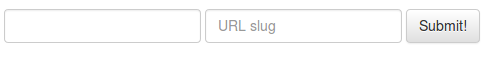
Group Addon
You can render a control composition using input_group.
= f.input_group :title, label: "URL Slug", inline_col_class: ['col-md-6'] do |input|
  = input.group_addon('<input type="checkbox" value="1"/>')
  = input.control
Note that control allows you to output the actual input control at any point.
Input Options
The following snippet is an example of available options.
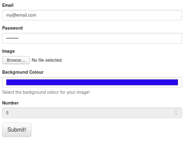
= form(input_options, url, enctype: 'multipart/form-data', builder: :bootstrap3) do |f|
  = f.input :id, type: 'hidden', value: "some_id"
  = f.input :email, type: 'email', label: "Email"
  = f.input :password, type: 'password', label: "Password"
  = f.input :image, type: 'file', label: "Image"
  = f.input :background_color, type: 'color', label: "Background Colour", hint: "Select the background colour for your image!"
  = f.input :number, type: 'number', label:"Number", disabled: true, value: '5'
  = f.submit content: "Submit!", class: ['btn-lg']
Which will render:
Type
Use type to have for example hidden, password or file type. Here the list of textual input types.
Make sure to add enctype: 'multipart/form-data' as argument in the form to have the full path from the file type input.
This might be done automatically in future releases.
Value
Use value to set the content of an input, in our example above id is set as "some_id".
Help Block
Use hint to have an help_block with some useful words.
Select
The select method receives the same options of input (not type and prompt instead of placeholder) plus the options for multiple choices: multiple and collection.
= form(select_box, url, builder: :bootstrap3) do |f|
  = f.select :select_basic_roles, label: "Basic Roles", collection: roles_array, prompt: 'Choose a role'
  = f.select :select_roles, label: "Basic Roles with value", collection: roles_array, value: "Admin"
  = f.select :select_complex_roles, label: "Complex Roles", collection: complex_role, value: "i"
  = f.select :select_multi_complex_roles, label: "Multiple Complex Roles", collection: complex_role, multiple: 'multiple'
Which will render:
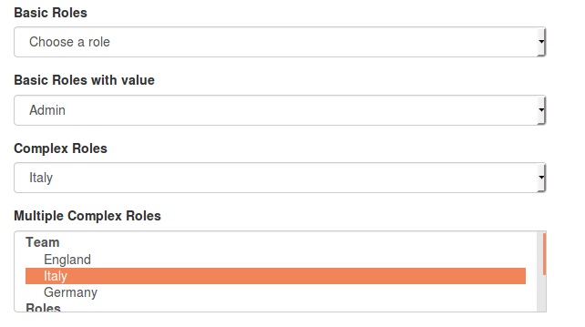
For multiple choices multiple: 'multiple' needs to be one of the options and, of course, collection too.
Here below the arrays used in this example:
roles_array = [["Admin", 1], ["Owner", 2], ["Maintainer", 3]]

complex_role = [['Team', [['England', 'e'], %w(Italy i),['Germany', 'g']]],['Roles', [['Fullback', 0], ['Hooker', 1], ['Wing', 2]]]]
Check and Radio box
The checkbox and radiobox have the same API
.col-sm-6
  = f.checkbox :is_public, label: "Basic Checkbox", value: true
  = f.checkbox :is_not_public, label: "Basic Checked Checkbox", checked: 'checked'
  = f.checkbox :check_roles, label: "Multiple Checkbox", multiple: 'multiple', collection: roles_array
.col-sm-6
  = f.radio :is_public, label: "Basic Radio", value: true
  = f.radio :is_not_public, label: "Basic Checked Radio", checked: 'checked'
  = f.radio :check_roles, label: "Multiple Radio", multiple: 'multiple', collection: roles_array
= f.submit content: "Submit!", class: ['btn-lg']
Which will render:
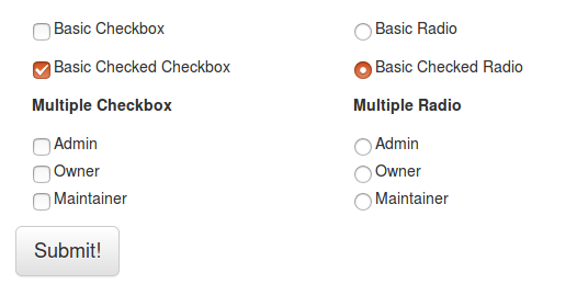
When value and the form property (is_public)’s value are matching the check/radiobox will be checked - so make sure to set it properly.
Override the ticked/checked state using checked: 'checked'
Inline Form
To render an inline form you just need to change the builder.
= form(model.contract, url, builder: :bootstrap3_inline) do |f|
  = f.input :title
  = f.input :url_slug, label: 'url slug', placeholder: "URL slug", label_options: { class: ["sr-only"] }
  =f.submit(content: "Submit!")
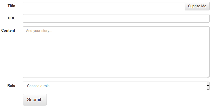
Horizontal Form
= form(model.contract, url, builder: :bootstrap3_horizontal) do |f|
  = f.input_group :title, label: "Title" do |input|
    =input.control
    =input.group_btn("<a class='btn btn-default' href='/'>Suprise Me</a>")
  = f.input :url_slug, label: 'URL'
  = f.textarea :content, placeholder: "And your story...", rows: 9, label: 'Content'
  = f.select :select_roles, collection: roles_array, label: 'Role', prompt: 'Choose a role'
  = f.submit content: "Submit!", class: ['btn-lg']